You might have heard this phrase before: when all you have is a hammer, everything looks like a nail. That’s when someone acquires a new tool and starts using it everywhere, regardless of whether it fits the task. This phenomenon is called the Law of the Instrument . A related concept is the Einstellung Effect , which describes the overreliance on a familiar problem-solving pattern (a cognitive tool rather than a physical one).
Junior designers, like everyone else developing their craft, are prone to such biases. I’ve been there. Back in art school, I had a period when I did typesetting in all-caps, with only one size and weight and a monospace font and I used it for everything. It felt clever and looked pleasingly uniform. But I prioritized personal preference over function. My text was hard to read. There was no hierarchy.
Here’s a little story. Let’s imagine John, a fictional designer at Apple. He has just learned a new design concept. It makes sense to him and it even involves simple math. Designers often rely on intuition, but John now has a theoretical framework to justify his decisions.
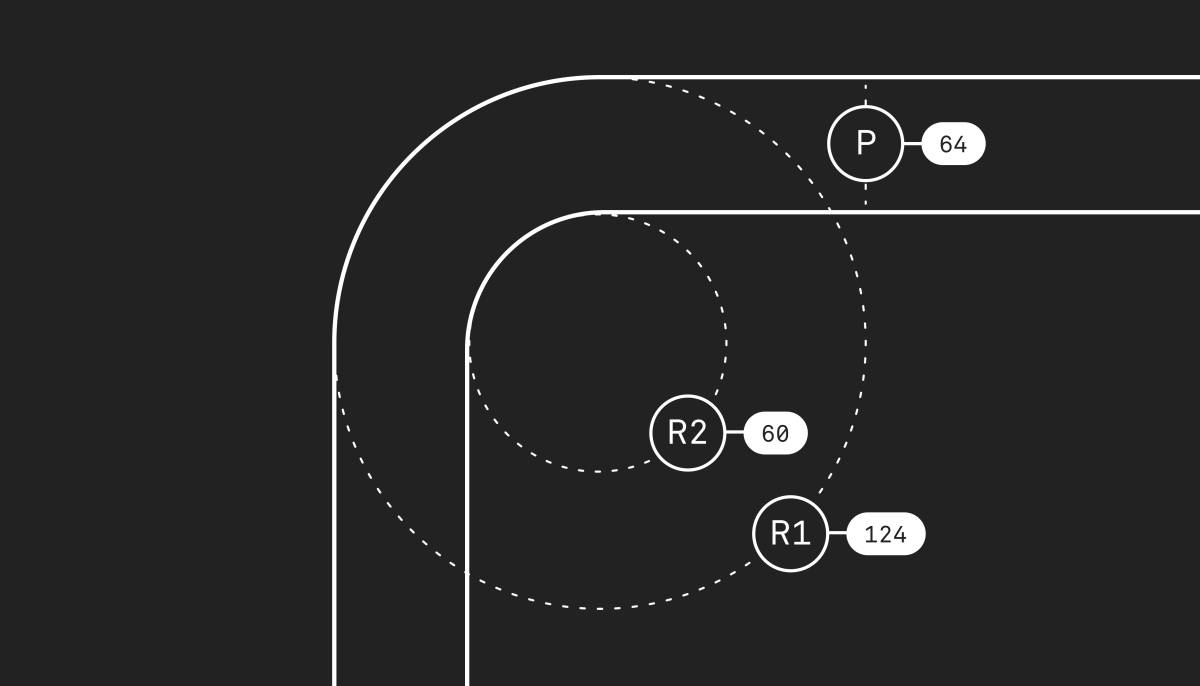
The two nested rounded rectangles are concentrically aligned.
The concept illustrated above is called concentricity: two or more shapes perfectly arranged around a common center. We can describe the illustration with a simple formula:
R1 (outer radius) − P (padding) = R2 (inner radius)
It’s basic geometry, and it has its place in any designer’s toolbox.
Mismatched corner radii create visual noise, most noticeable when the nested rounded corners have tight padding. The effect is subtle in isolation, but it adds up across a whole UI. Especially in already busy and complex interfaces, minimizing such friction is good craft.
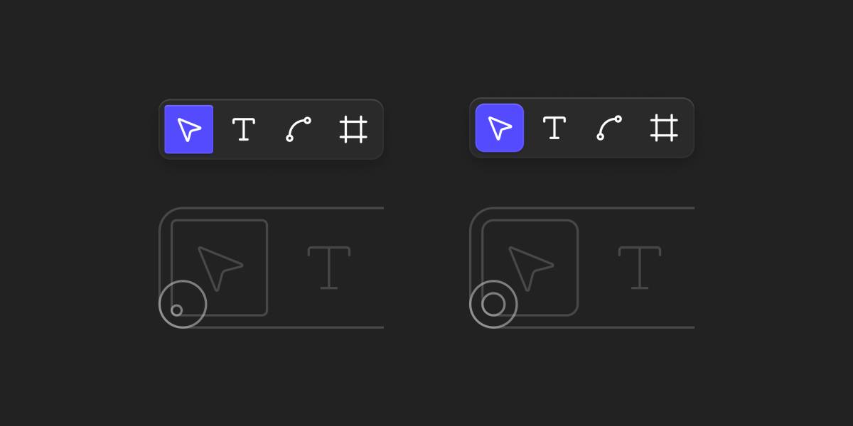
With its concentric alignment of border radii, the UI component on the right looks more polished.
We’re back at Apple’s design studio. Someone just spilled a glass of perfectly liquid water on the desk nearby, but nobody noticed … yet.
John is fixated on three colorful discs at the upper left of the Finder window. The window’s rounded corner nearly touches the smooth corner of his MacBook’s screen. He squints his eyes. Close button, window corner, display corner — none of these corner radii match. So John applies his new trick: concentricity.
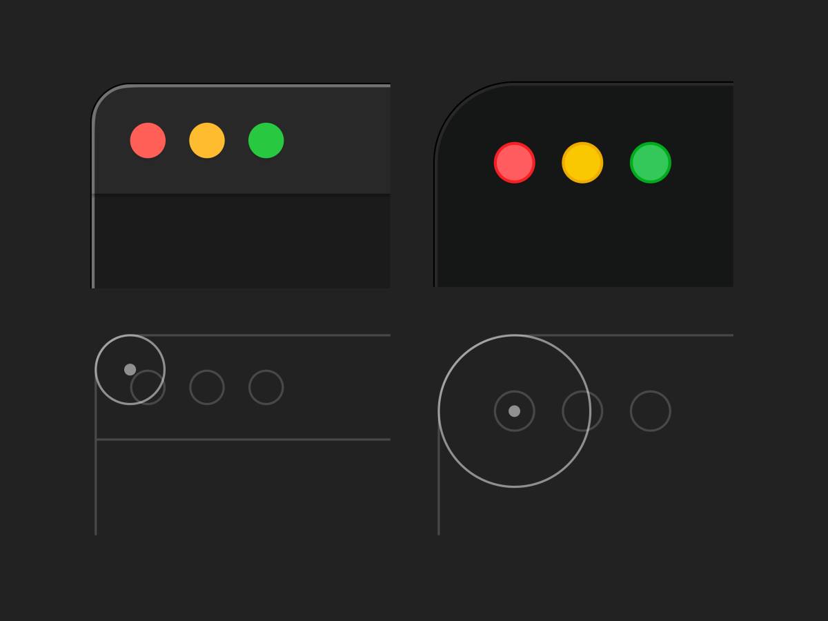
The window detail on the left is from macOS Sequoia, the right is from macOS Tahoe. On Tahoe, the window’s border radii are increased to align concentricly with the traffic lights.
When Apple’s designers made this fundamental change, they likely realized that preserving perfect concentricity across varying toolbar compositions and different displays results in a range of corner radii.
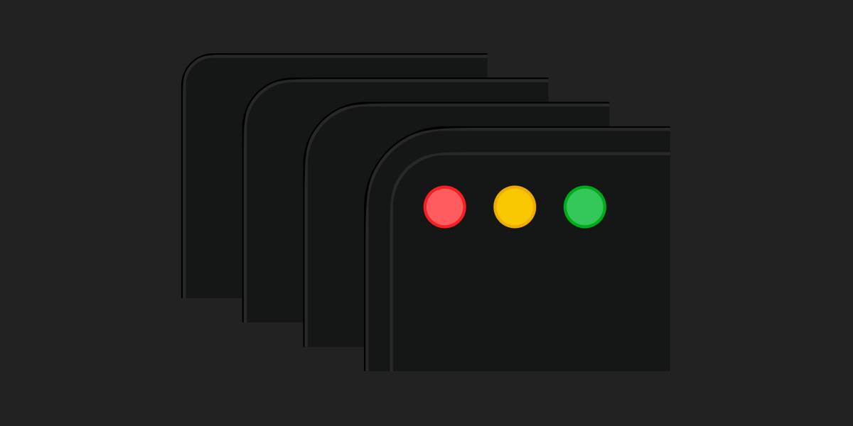
Don’t worry — Apple has enough corner radii for everyone.
This also introduces new questions. Do windows inherit their corner radius from the outside (the rounded display panel)? Or from their enclosing controls (the traffic lights and action buttons)? And if the latter, do the controls at the top or bottom of a window inform its corner radius? This is confusing, especially since it wasn’t an issue before. As a consequence, developers are now given a dedicated new SwiftUI API which calculates and applies concentric corner radii.
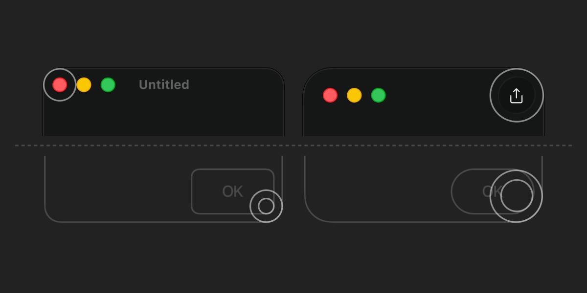
macOS Tahoe windows feature varying corner radii, concentrically aligned from UI elements along the top edge. At the bottom, however, elements must adapt to the window’s bounds instead.
It might also make sense that Apple’s UI inherits such pronounced rounding on iOS devices or the Apple Watch, but less so on macOS. The company knows that, saying:
… In dense desktop environments, capsules [heavily rounded shapes] are best used for standout actions. On macOS, Mini, Small, and Medium controls will continue using [less] rounded rectangles, making them a great fit for compact, high-density layouts …
And yet, they added heavily rounded windows and buttons throughout macOS (a dense desktop environment). I believe this is both a naive interpretation of research and an overuse of a single concept.
Furthermore, these redesign efforts suggest ignorance of a fundamental problem: rounded forms have a smaller surface area than angular ones. Used as containers, they reduce usable space.
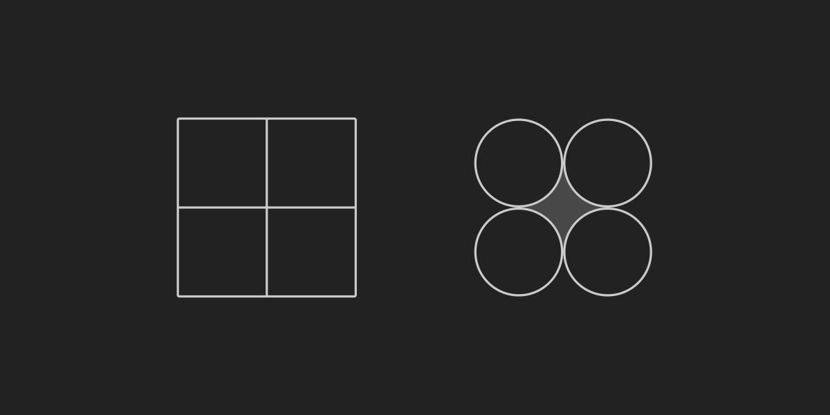
Rectangular shapes can stack with no spacing between them. Packed rounded shapes always produce gaps.
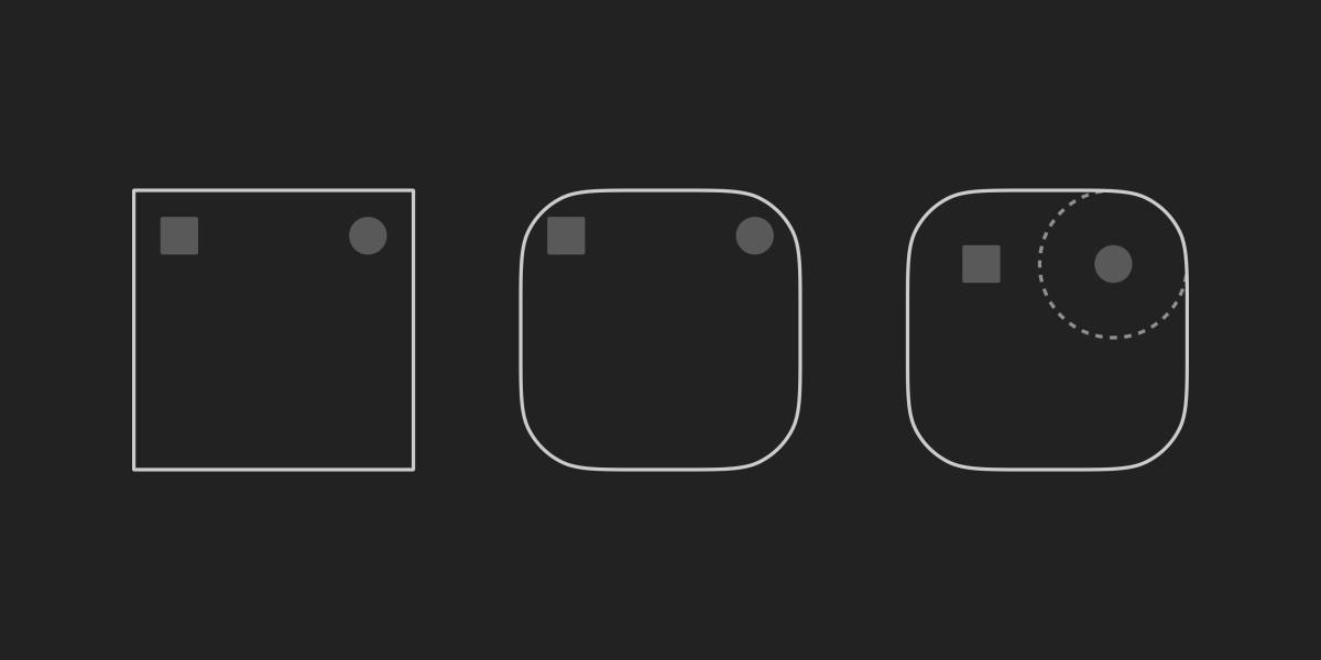
Heavily rounded containers provide less usable space at their corners, forcing enclosed objects further inward. This results in less available area overall.
This is fine on most touch-based UIs since they typically feature simple layouts with only a few controls and plenty of white space. Such spacious designs help our fingertips, which demand larger touch areas. A mouse pointer, by contrast, can target much smaller elements.
Professional desktop software — think 3D modelling, video editing, or music production — is often packed with small controls. On these complex interfaces (and the operating systems that host them) screen estate is precious, even on large screens. Heavily rounded elements don’t work well here.
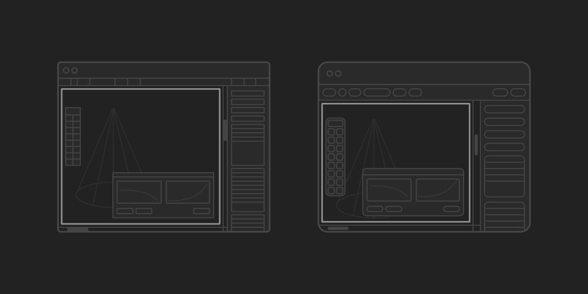
The straight shapes in the desktop UI on the left stack tightly, leaving more canvas to work on. The heavily rounded UI on the right requires more spacing and reduces the available area.
Apple is well aware that principles from pointer-based UIs rarely translate well to touch interfaces. After all, they spearheaded the evolution of touch UIs and introduced multi-touch interactions like pinch-to-zoom to consumer electronics — formerly only seen in science fiction or obscure research projects . Yet they’re now rolling out single unified design language across watches, phones, desktop computers, and XR goggles.
Closeup video of the bottom toolbar of the Apple Music app on an iPhone: the glass-like UI design reflects and distorts to the content scrolled underneeth. Its layout changes with liquid motion, responding to the scroll direction.
This is how the first version of Liquid Glass looks in an iPhone. The controls are heavily rounded to follow the displays curved edges. Notice how hard to read the button labels are — due to their distracting background and low contrast. (© Apple)
As a result, heavily rounded corners are now an integral part of Liquid Glass , a responsive material that shifts form, reflects light, prominently features floating controls and blurs or distorts what lies behind it. It aims to to focus attention on the content by reducing UI chrome. In practice, it undermines its own premise as it adds noise and distraction, demands more space, and triggers a cascade of layout problems. To make this worse, the first official releases are full of buggy animations and broken layout details — something that seemed impossible under Steve Jobs’ oversight.
As a pioneer of UI design , Apple built a trove of expert knowledge . First it shaped personal computing with the launch of the Macintosh, then it defined mobile computing with the iPhone. Yet its almost unmatched expertise and attention for detail appears to be in decline.
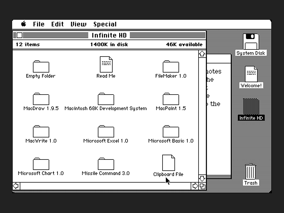
This is System 1.0 which shipped with the first Mac. Much of this ground work is still recognizable in modern desktop UIs. The screenshot is taken from the phantastic online emulator at infinitemac.
Given its heritage, it’s no wonder Apple remains an authority for junior designers. Many assume that if Apple does it, it must be right. But when Apple makes mistakes — especially when it should know better — its influence becomes a problem.
Maybe the company seems to acknowledge that. While I was working on this article, macOS 27 (Golden Gate) was announced. The screenshots ( #1 , #2 ) suggest a rollback of the heavily rounded window corners. The executive responsible for Liquid Glass — a designer with a background in advertising and graphic design — left for Meta and was replaced by a longtime Apple employee trained in UI and interaction design.
Let’s see if Apple can return to the high standards they once set themselves. Not because I particularly care about that company. I care about my craft. We need good examples for future generations of designers.
Selected links from this article
- The Law of the Instrument Wikipedia article
- Einstellung Effect Wikipedia article
- Angular vs. curved shapes Research paper
- Liquid Glass Is Cracked Article criticizing Liquid Glass
- Videoplace Interaction design research project from 1984
- Origins of the Apple Human Interface Lecture from 1997
- Infinite Mac Emulations of Apple OS in your browser
- Apple HIG Archive of Apple’s Human interface guidelines