The other night, I went to see a movie I knew nothing about: Backrooms. It left me physically exhausted. Still processing it the next day, I realized that this film, perhaps intuitively, derived its unique mechanics of horror from fundamental design principles.
Backrooms is based on a series of found-footage-style YouTube shorts . The true stars of both the series and the film are the sets, not the actors. Shot mostly indoors, those rooms are reminiscent of so-called liminal spaces — office-like hallways, sparsely furnished in yellowish and brown tones, fitted with wall-to-wall carpeting and illuminated by neon ceiling fixtures. This 1990s aesthetic is familiar enough to feel real, yet distant enough to be unsettling.
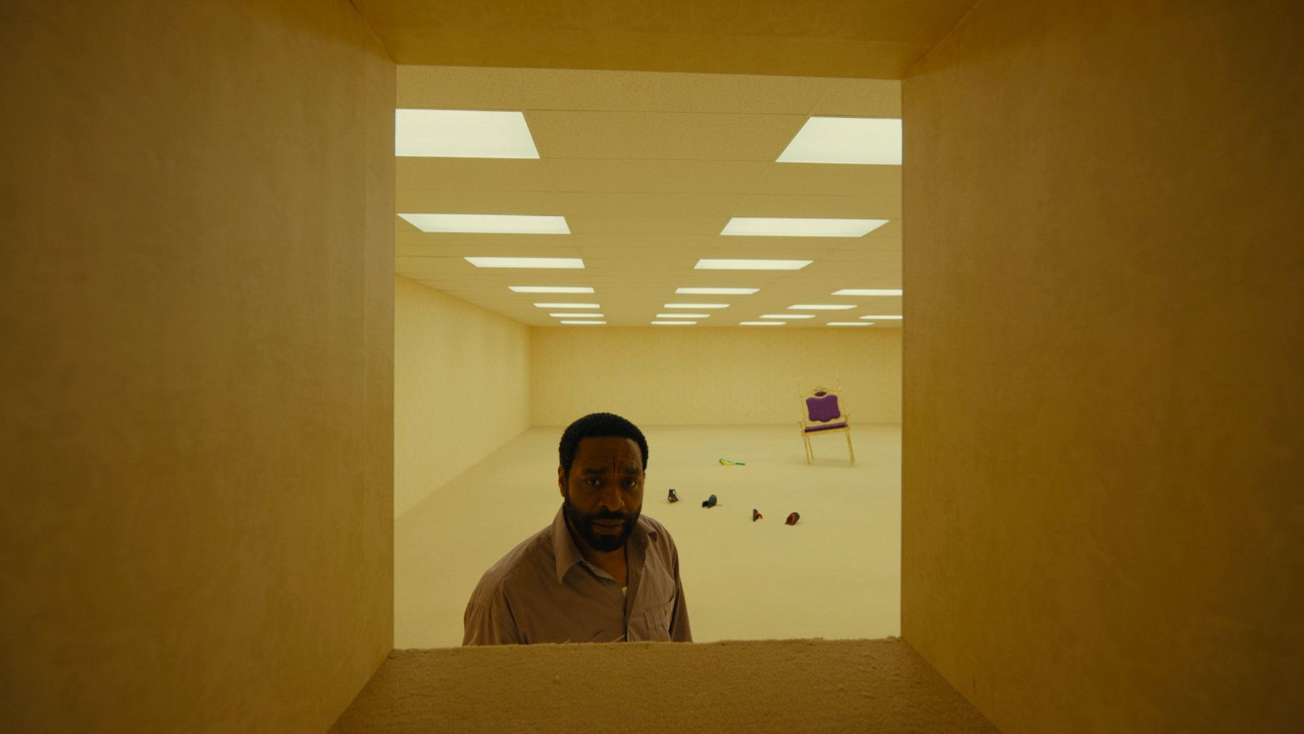
This architecture makes no sense. Also notice how the objects in the background seem to sink into the floor. (Movie still from Backrooms, © A24)
The set designs create an eerie atmosphere that slowly intensifies as the story progresses. The architecture is distorted, as if viewed through a cracked lens. Rooms are interrupted by shallow walls and lead to unlit dead ends. Some walls have cutouts like windows but at weird positions. Doors are of unusual size and have multiple knobs. Here and there a shaft cuts through the massive strucure, leading deep down or high up. Some walls converge on a single point, like a funnel threatening to crush us when we try to pass through it.
We see furniture and clothes in this distorted indoor universe, sometimes scattered loosely but mostly arranged in chaotic piles. These artefacts amplify the haunting absence of humans, since they were precisely designed to carry or cover our bodies.
As the architecture is skewed, so are the objects within it. Some appear entangled and unnaturally merged into one another or into the floors, walls, and ceilings. It looks as if the scenery was cobbled together in 3D graphics software. (That was entirely the case for the series. The movie’s sets were mostly practically built.)
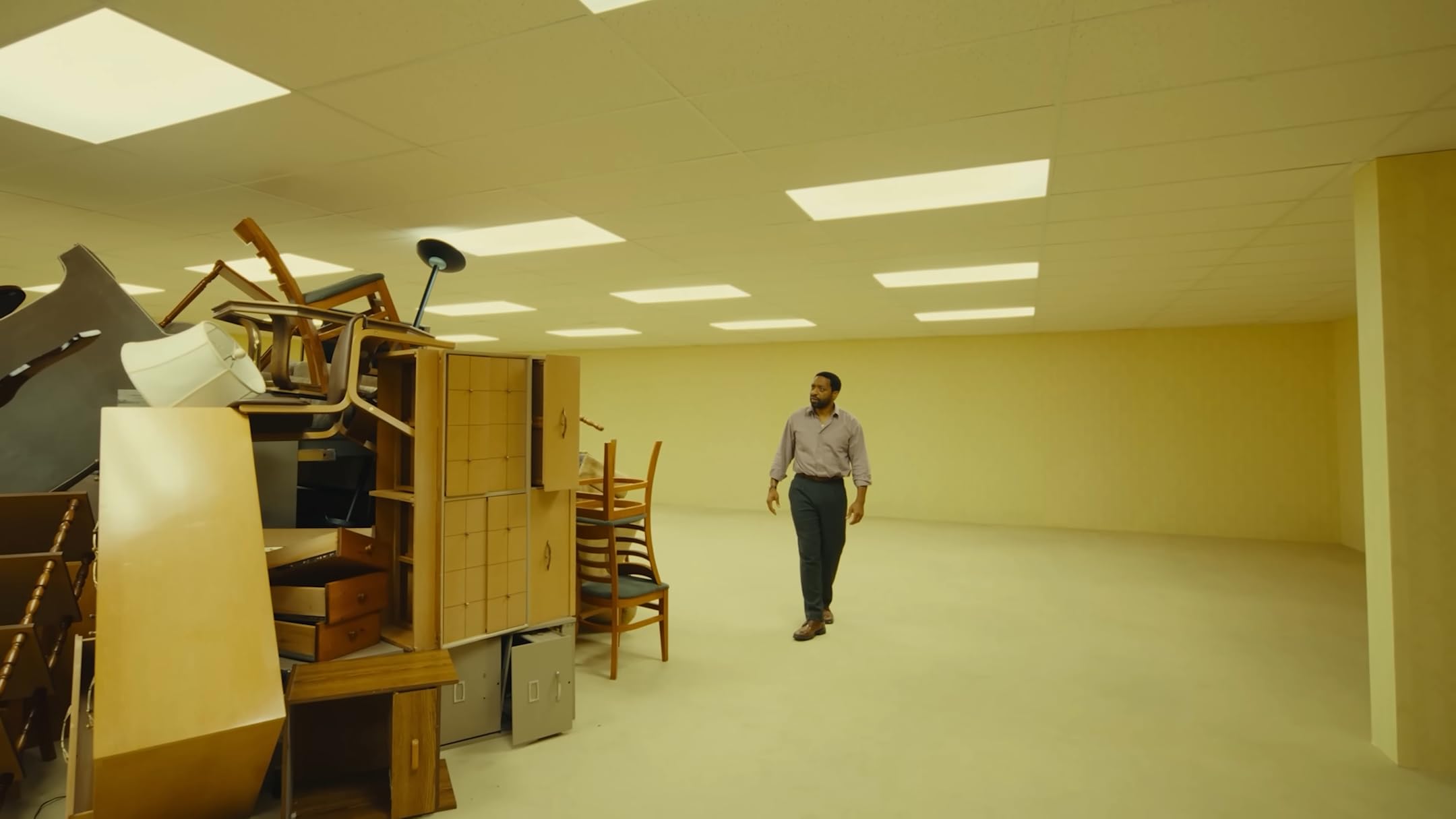
The protagonist inspects a pile of furniture, some of which seem to have grown together. (Movie still from Backrooms, © A24)
The film received some criticism for being superficial, with shallow characters and a rather distracting plot. I’d argue that it is the very surface from which the movie draws its unique effect. The aesthetic is the whole point. The drama is just decoration.
Design theory has a concept called affordance . It has its roots in cognitive science and refers to the information we gather from seeing an object before interacting with it. It’s what an object offers us to do with it.
Most objects — especially those designed by humans for other humans to use — feature one or more signifiers that hint at what you can do with them and how. This could be the shape of a door knob or the finger holes of a pair of scissors. We seem to unconsciously form a three-dimensional representation of such cues in our imagination, to virtually explore how our body could interact with them before we touch them: how our hand must shape to grab a knob, how our wrist must turn to operate it.

Windows 95 features several UI details which act as signifiers. Small grooves and ridges tell the user that it is possible to grab and move elements — eg. to resize windows or to drag and reorder palettes.
Designers are trained to use this effect to guide people. Think of it as an elegant built-in instruction. The form itself speaks to its function. This applies to UI design as well. Perhaps you’ve noticed small ridges on interface elements that signal you can grab them with your cursor to resize or reposition them.
Backrooms subverts the human-centered concept of affordance and twists it into horror through anti-human design. Signifiers now reveal obstacles or traps; sometimes they confuse or mislead us.
As people are mostly absent and we frequently explore the space through first-person shots, we are forced to imagine ourselves walking those distorted hallways and interacting with those skewed objects. In one scene, the protagonist grabs two fused chairs and moves them for us — demonstrating how clunky that must feel.
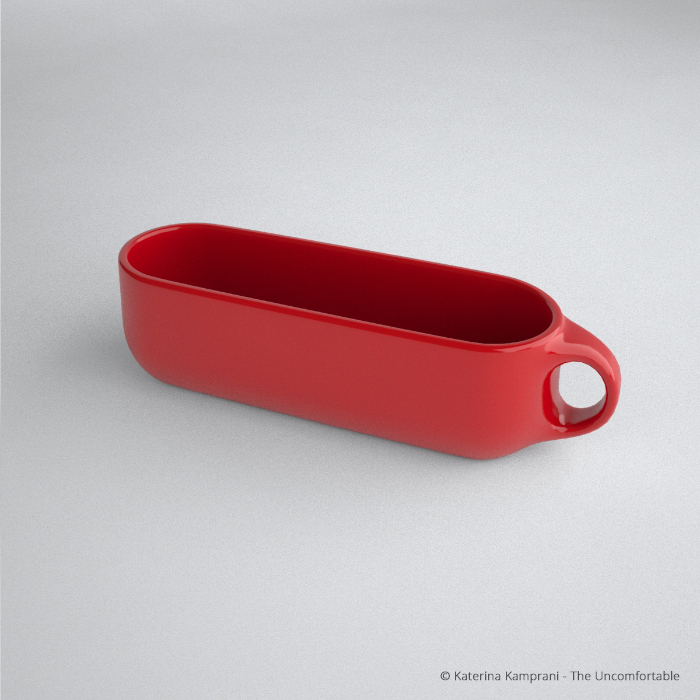
You can imagine the pain of using this long mug from simply looking at it. (Image courtesy of Katerina Kamprani, the Uncomfortable)
As the movie continuously forces us to imagine interacting with its hostile environment, our minds strain to process the surreal surroundings. When a sudden movement or strange sound breaks into that state, it hits extra hard.
Showing scenes from Backrooms to design students would be a memorable way to teach about affordance — just in reverse. How do you design a floor plan to make people get lost? How do you make a room especially uncomfortable to move through? How do you build a chair that no one can sit comfortably in?
Prototype those designs and document what makes them fail. Invert those rules and you may have just discovered some fundamental design principles.
Use that knowledge responsibly .