Since the Industrial Revolution, a whole economic sector has formed around trends: the fashion industry. Its designers change colors, fabrics and cuts with every new collection, at least twice per year. Its younger, uglier sibling, fast fashion, is churning out new looks every other week.
Whether you shop at Chanel or Shein — if you want to stay en vogue, you need to buy new clothes on a regular basis.
Not every trend has the same impact. Some can lead to substantial change — like when Chanel popularized women’s trousers in the 1920s, while skirts were still the norm. Yet some designs are so crucial to their context that trends only ever affect their surface level. Pants for women were cut to a different silhouette. They still had two legs.
Trends are not limited to clothing. Other industries have their own cycles of what’s in or out. Automakers might change the body of a new model, but they wouldn’t make its wheels hexagonal in shape. In fact, the design of wheels is so fundamental that we proverbially do not reinvent them.
There are similar examples in my area of work. Windows are such fundamental components of desktop operating systems that some companies even include the word in their product names. Their basic design did not change much over time. Just like with pants and wheels, their inventors seem to have nailed them very early on.
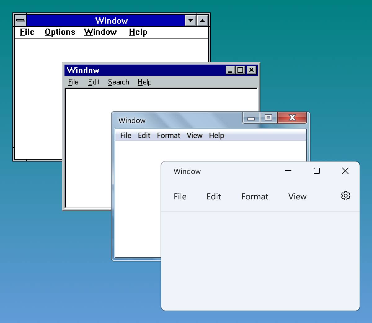
The visual evolution of windows in Microsoft Windows: while the surface changes, the structure persists.
Such enduring, perhaps timeless, designs emerge because they respond to requirements that hardly change over time. Tailors must work with the human physique. Engineers must obey the laws of physics. Anyone who designs user interfaces must apply the principles of human psychology.
In the early twentieth century, German and Austrian psychologists discovered a set of rules called Gestalt Principles.
The theory states that the visual input from our surroundings is overwhelming, while our perception is limited. If we cannot organize the information we receive, we cannot make sense of the world around us. That’s why our brains seem to have developed strategies to detect and process patterns. Designers use this knowledge, often intuitively, to guide people through visual composition.

The white circles on the left side of the illustration seem related because they look alike and differ from the other circles around them (Similarity Principle). Several circles on the right side seem related because they are closer together, forming clusters (Proximity Principle).
In 1992, an addition to the classic Gestalt Principles was proposed: the Common Region Principle. Elements tend to be grouped together if they are located within the same closed region. Designers use it for the strongest emphasis of relationship between objects, basically by drawing boxes around them.
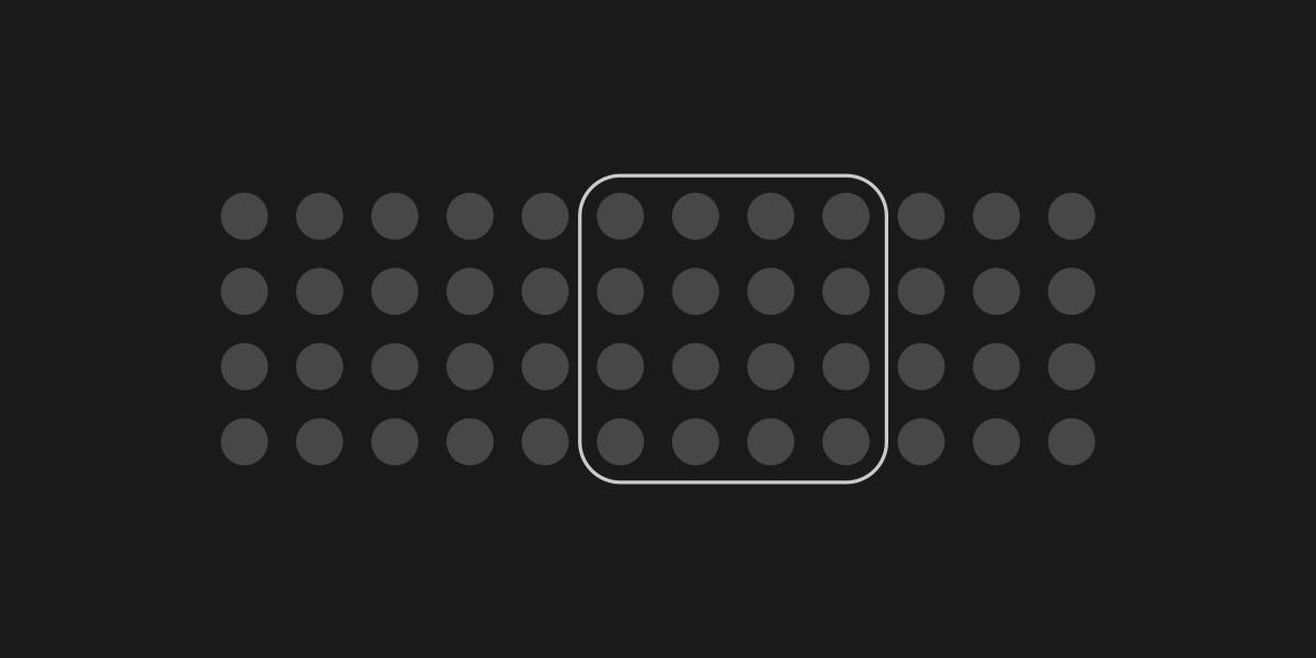
Common Region Principle: Among identical circles, one group seems related because a rectangle encloses it.
The windows of a graphical operating system are such logical containers. They are defined by their visual boundaries, typically outlines and shadows. Further compartmentalization happens inside windows.
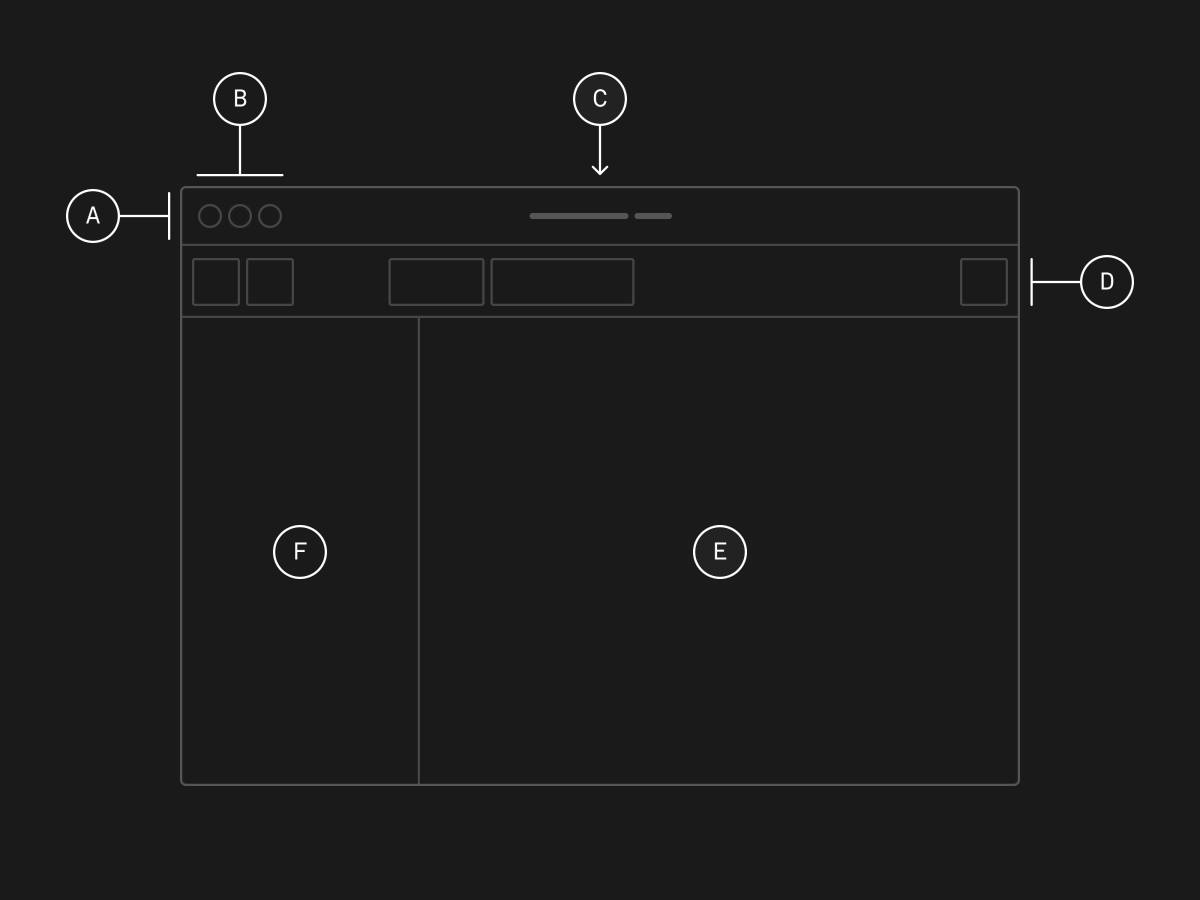
The anatomy of a typical desktop OS window
A typical window has at least a titlebar A , containing window controls B (e.g., close, minimize, maximize) and the title C , spanning the whole width. Below that is the main content E .
The windows on most platforms also include toolbars or menubars D for contextual actions, and sidebars F for navigation (typically on the left side) or contextual information (typically on the right side).
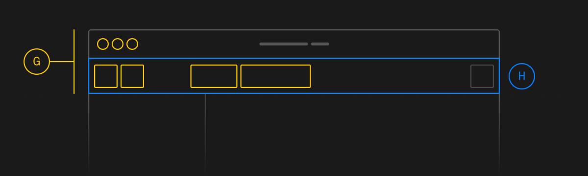
Gestalt principles at work
That’s a clear composition. Buttons and window controls appear related because they follow the Similarity and Proximity Principles G . Sidebars and toolbars are clearly separated from the main content because they sit inside visually marked common regions H .
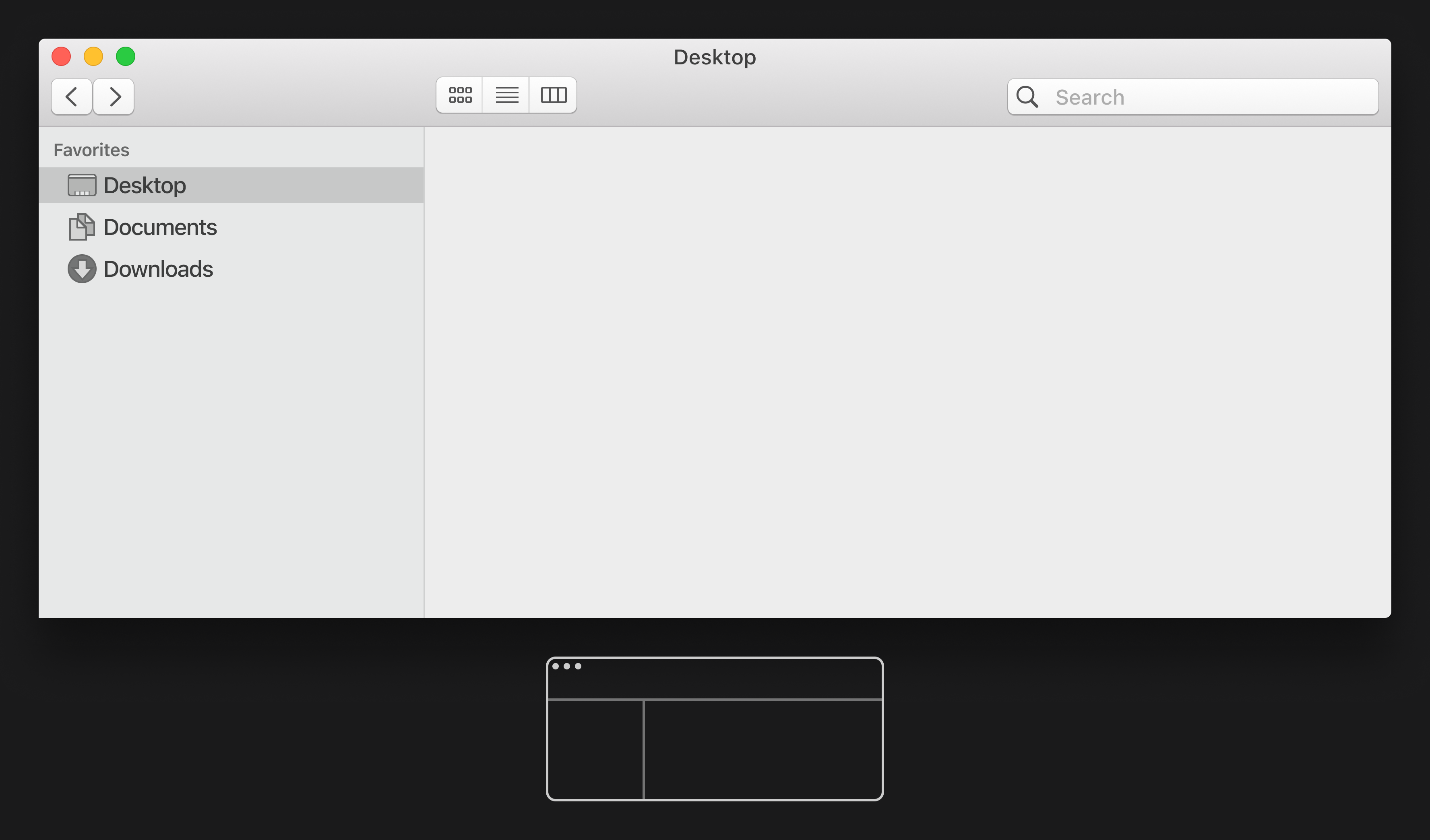
A window from macOS Catalina (2019). This is the last version of Apple’s OS with the classic window anatomy.
With the release of macOS 11 (Big Sur), Apple introduced the biggest change to their window layout in over 30 years. Most noticeable is the new sidebar, which occupies the whole height. The window title is now left-aligned instead of centered, and merged with the toolbar.
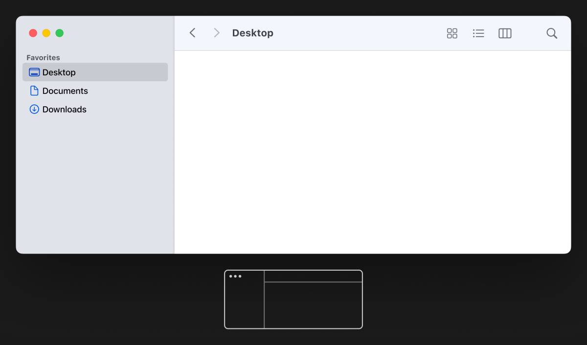
With macOS Big Sur (2020), the window anatomy substantially changed.
The window controls now sit inside the visually separated sidebar. By the Common Region Principle, they appear to belong to the sidebar, not to the window. (This also reminds me a bit of drawers in OS X.)
As a side note, several apps like App Store, Apple Music, Podcasts, and Reminders introduced a full-height sidebar even before macOS adopted it system-wide. The Linux desktop environment GNOME developed a similar sidebar in 2023 and Microsoft’s Fluent Design language for Windows now also features a unified title bar.
While this layout was already confusing, I think it got even worse with the next major design iteration of macOS.
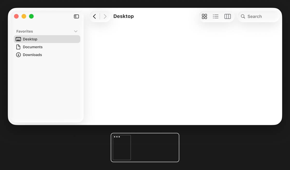
macOS Tahoe (2025) applied Apple’s new design language Liquid Glass — yet again the window anatomy changed noticeably.
With the translation to Apple’s most recent design language, Liquid Glass, macOS Tahoe’s window controls sit inside a redesigned sidebar that resembles a popup with its own controls. In fact, this is a navigation element for the parent window, but this relationship is visually disrupted. By the Figure-Ground Gestalt Principle , the whole window looks like a backdrop, the sidebar like a separate object on top of it.
The revised toolbar has no visual container. Its buttons float on top of the content area and the window content shows underneath its buttons and the padding around the sidebar. Apple’s designers may have noticed how busy this looks, so they applied a gradient blur for the toolbar and a rather over-engineered background extension effect for the sidebar.
Just a year later, Apple reverted the layout of the sidebar with macOS Golden Gate. The sidebar attaches to the window again and the toolbar regained a subtle backdrop, which is only visible with content underneath it. Now we basically have Big Sur’s window anatomy with Liquid Glass buttons.
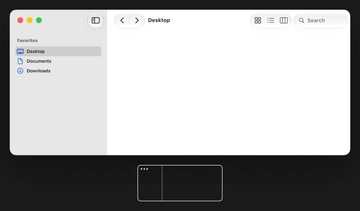
With macOS Golden Gate (2026), the window anatomy changed again.
That’s a lot of back-and-forth for a company that has a reputation for setting standards in UI design. It’s not a great look.
If Apple only wanted to refresh the appearance of its desktop OS without violating fundamental design principles and align it stylistically with iOS, I could imagine alternatives. How about a simple full-width titlebar, window controls that appear related to the window, a clearly marked content area, input fields that look different than buttons, a bit more contrast and colored icons for faster recognition?
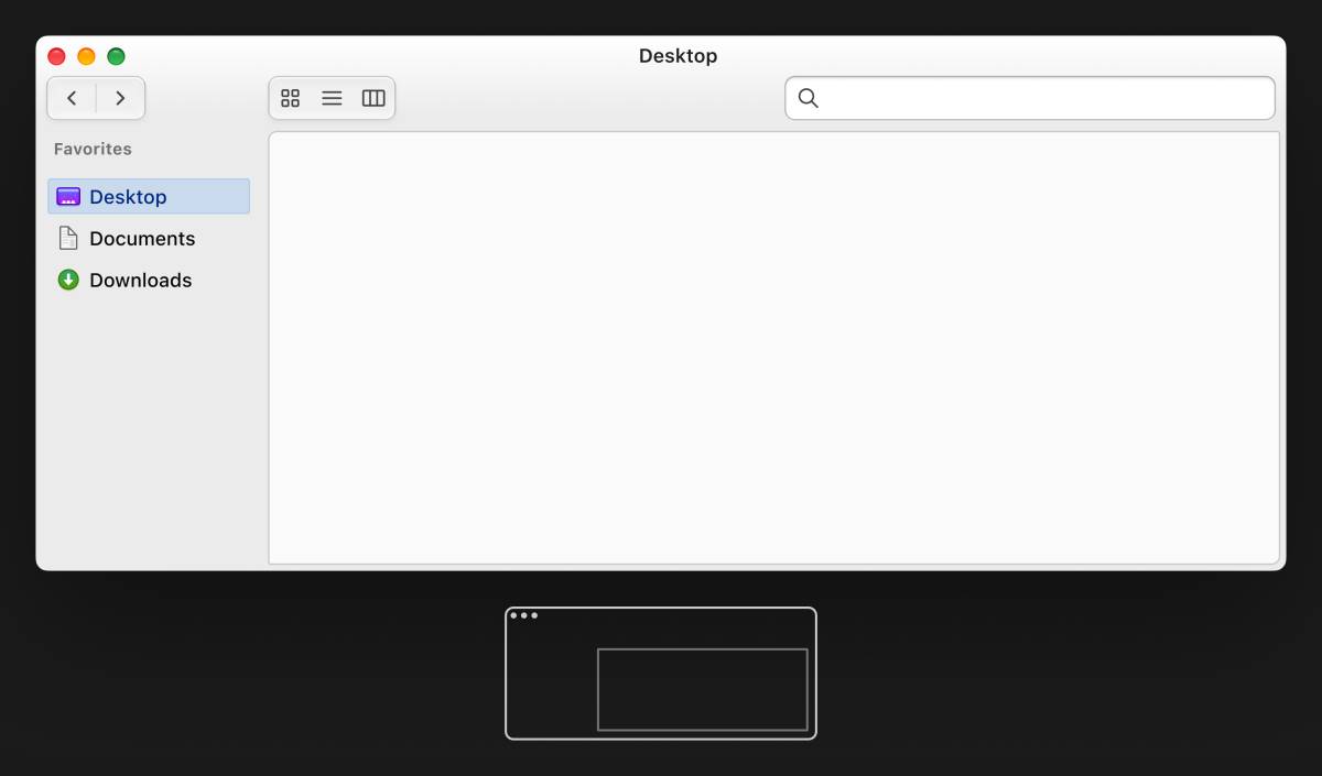
A fictional macOS window where I combined stylistic details from older OS X designs with Liquid Glass. It’s a visual refresh, but the composition remains logical and clear.
Now that the long-rumored MacBook with touch screen finally got released, it seems that many design changes of macOS aim to make macOS look more like iOS. But since Tahoe, the macOS desktop looks like a pile of weirdly-sized iPhone screens instead of proper windows.
Combining design solutions for pointer-based systems and those for touch systems into a single UI goes at the expense of unnecessary friction for all macOS users. Does Apple willfully compromise the user experience of macOS just to sell a laptop with a touch screen?
During his first term at Apple, Jobs famously persuaded John Sculley to join the company. Sculley was regarded as a marketing genius for having boosted Pepsi’s sales dramatically through extensive market research and clever advertising . For him, Apple’s hottest asset wasn’t its unmatched product quality. His point was to promote the brand and to sell a lifestyle, not just computers.
In 1986, after Jobs was pushed out and Sculley had free rein, Apple produced a bizarre mail-order catalog . The Apple Collection featured plenty of random products from other manufacturers with a slapped-on Apple logo. Most remembered today is the very ’80s clothing line from that catalog.
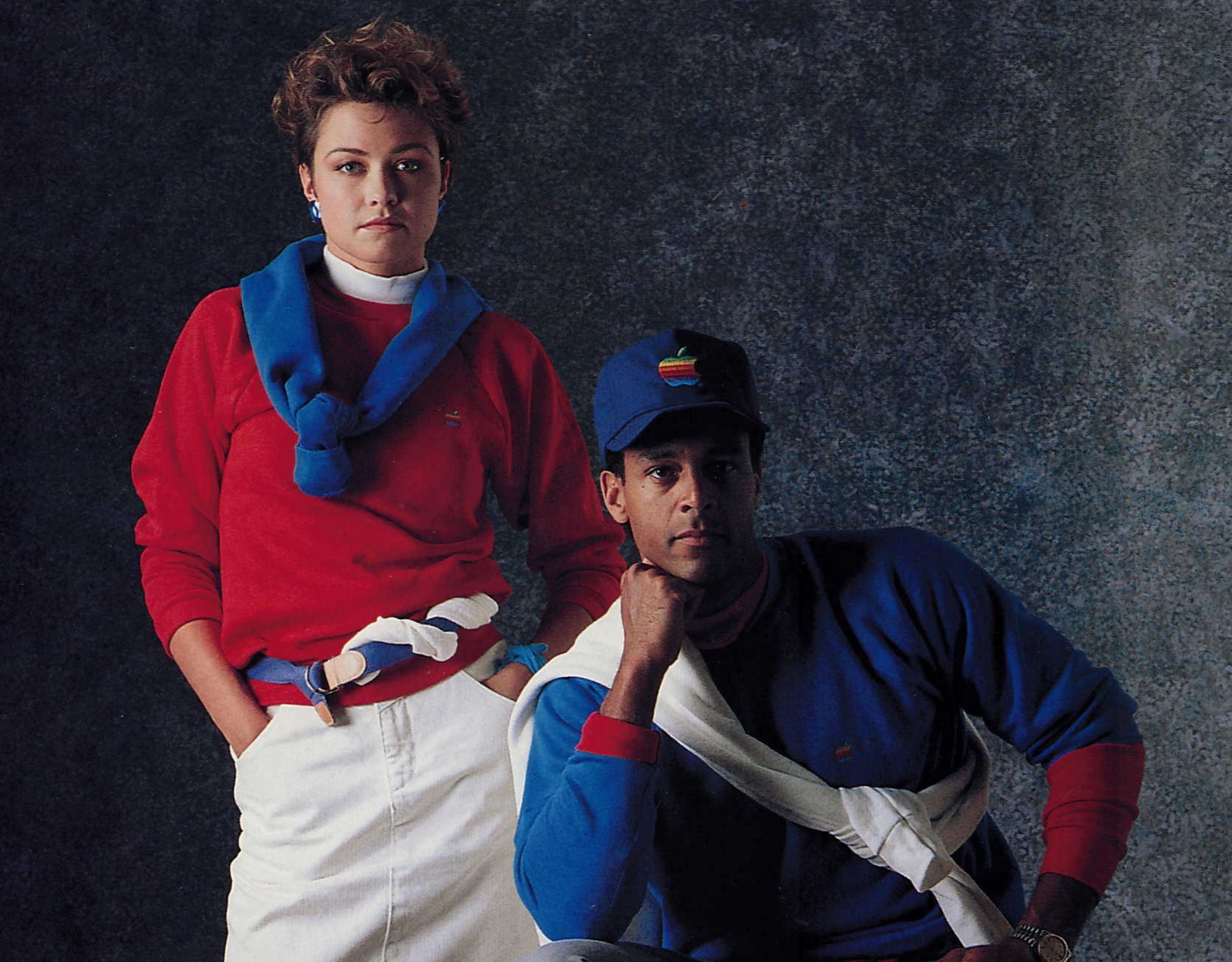
Apple once released a mail-order catalog with clothes and other branded items. Among stuff like a full-ass sailboard and a beer mug, the Apple Collection included a watch and a phone.
Apple was on the brink of bankruptcy when Jobs returned as CEO in 1997. It was the beginning of the era of the iMac, the iPod, and finally the iPhone. Mac OS X looked unlike any other OS at that time. And when version 10.6, Snow Leopard, was announced, it famously had zero new features but massive refactoring, transition to modern APIs and serious bugfixing. There was a certain balance between style and quality.
These days, the balance feels off. I first noticed that with the radical move of iOS 7 from skeuomorphic to flat design. The new design felt oversimplified, the contrast was bad, buttons didn’t look much different than the regular text around them, and everything whimsical got replaced with stone-cold Helvetica Neue Ultra Light . In the following years, the iPhone was prioritized over OS X, and Apple seemed to neglect the creative professionals who once formed the core of its user base. When Liquid Glass debuted, it felt to me like the most capable UI designers left the company.
At this point, selling whatever novelty at a fast pace seems to matter more to Apple than getting the details right. Instead of leading with innovation, the company seems to unshelve every half-baked project Jobs would have buried . It reminds me of the sell-out vibe from that Sculley-era Apple swag collection. I suspect the premium hardware and the brand reputation still justify high prices, even when the software doesn’t. That’s like a luxury brand producing fast fashion, hastily tailored with premium fabrics.
But we want to stay très chic — don’t we?